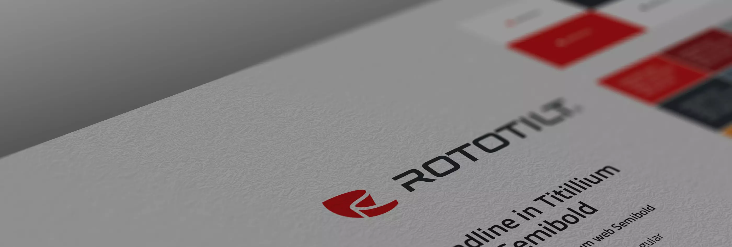
Our logo is a strong symbol of our identity, our promise and our goal. It is our visual marker that symbolizes the values, strengths and benefits we offer our customers and markets. The essence of the logo is the symbol of the heart and our origin. Approved colour variants are: Red symbol, black text (1A), Red symbol, white text (1B) and White logo against red background (1C).
Although free space is something invisible, it is important for the overall impression. When you have it, you don't think about it. And when a surface is not provided with sufficient space, the viewer feels uncomfortable – something is missing. Where the logo is used, it must therefore always have at least one space (T) according to the instructions. Consistent and uniform use of space around the logo produces a secure, calm and professional impression.